
color wheel showing primary, secondary, and tertiary colors with values
There are three types of colors on the color wheel. PRIMARY, SECONDARY, and TERTIARY colors make up EVERYTHING we see.
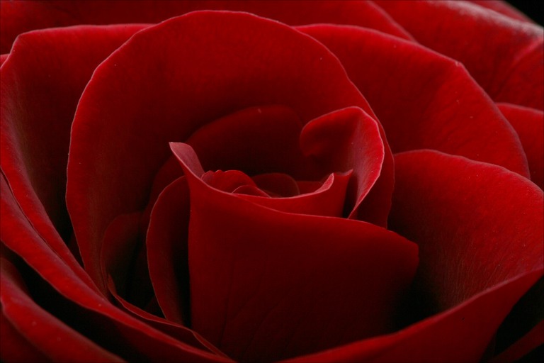
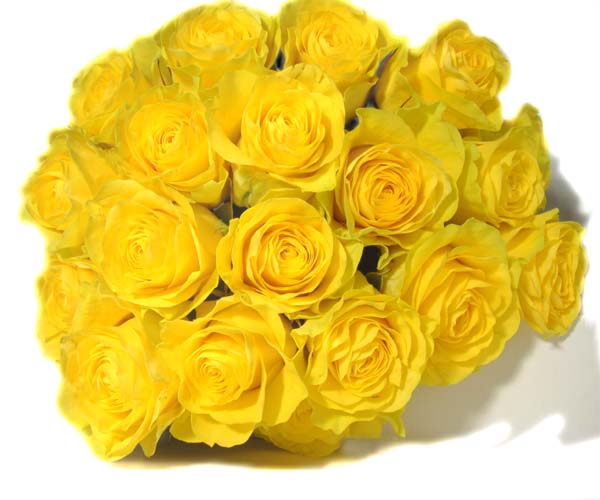
The PRIMARY colors are the FIRST colors (primary=first). You can't mix two colors together to make these. The PRIMARY colors are RED, YELLOW, and BLUE.
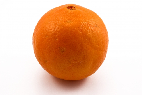
In visual art, when you mix two PRIMARY colors together, you get a SECONDARY color. The SECONDARY colors are ORANGE, GREEN, and VIOLET(PURPLE).
The third type of color is called TERTIARY color. These are the in-between colors. When you mix a PRIMARY color and a SECONDARY color, you get a TERTIARY color.
The TERTIARY colors are as follows:
Red-Orange
Yellow-Orange
Yellow-Green
Blue-Green
Blue-Violet
Red-Violet
The TERTIARY colors are as follows:
Red-Orange
Yellow-Orange
Yellow-Green
Blue-Green
Blue-Violet
Red-Violet

the straight lines show the primary colors
the dotted lines connect the secondary colors
The color wheel is a MAJOR tool used when creating a work of art.
Complimentary ColorsColors that are directly across from each other on the color wheel are COMPLIMENTS. They are directly OPPOSITE. When you put them together, they create CONTRAST. Your eye LOVES to see these colors together. In fact, your eye NATURALLY sees them together. If a person's skin color is more orange-ish, the shadows on their face will seem blue-ish.
 A painting by Kehinde Wiley
The artist chose a red background to CONTRAST the green in the subject's coat. Look at how it POPS! |
Analogous Colors
When an artist uses 2-3 colors next to each other on the color wheel, they create an ANALOGOUS color scheme. This is an easy way to create HARMONY in a work of art.
 An Installation by Sandy Skoglund.
The artist used mostly BLUE, GREEN, and YELLOW. This is used to achieve a sense of PEACE within the work of art. |
